Author Archive: GMD

How to add a legend to a map in QGIS

Open composer and click on the “add legend” button as shown below.

add legend button crop

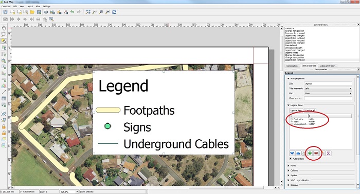
Once the legend has been added to the map, you can add and remove map layers from the legend as shown below.

add items to legend

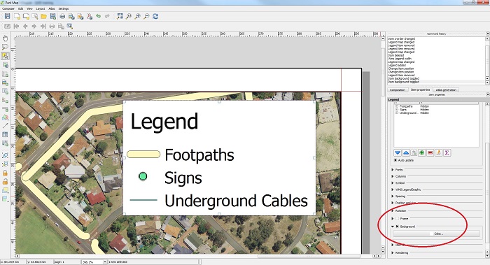
You can also add a frame around the legend box and change the background color to improve the visibility of the legend items if necessary.

frame and background color small

Make text standout in QGIS

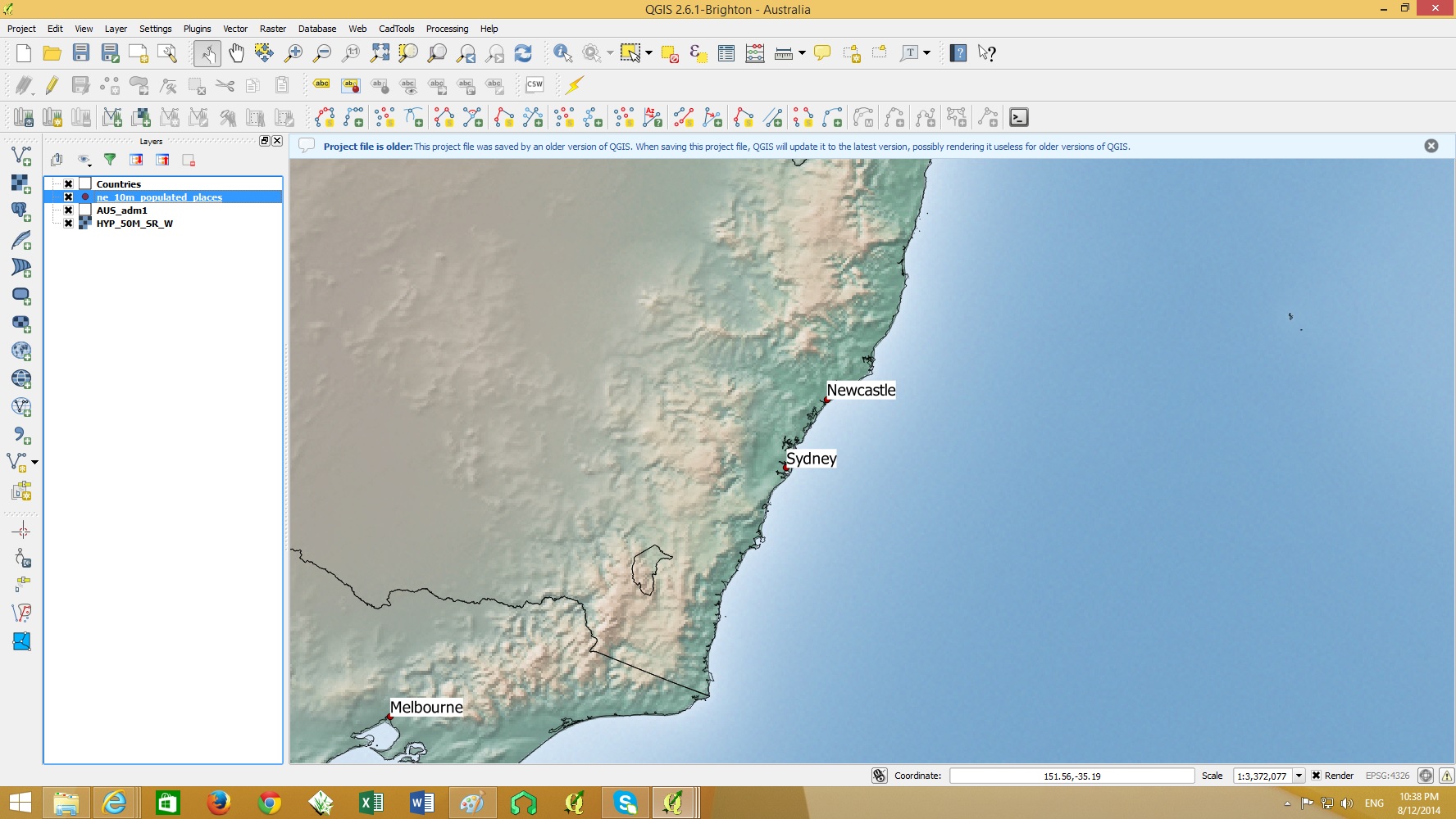
To make text standout from other map features we can either add a rectangle background or a buffer behind the text.

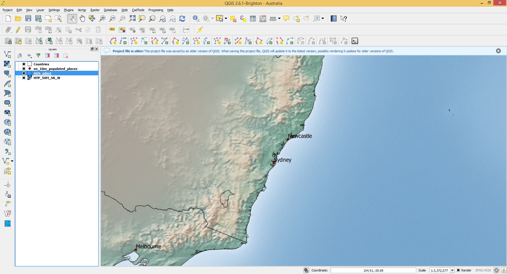
plain text

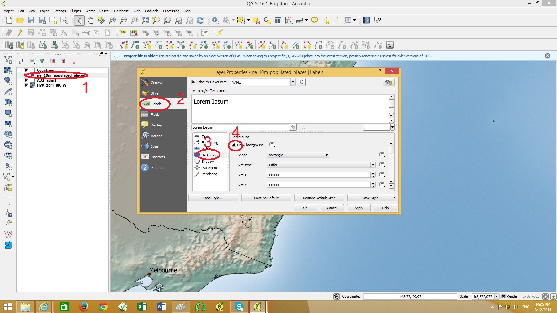
To change the properties of the text labels, double click on the layer containing the text > Labels > Background>Draw Background as shown below.

background on text

background on text 2

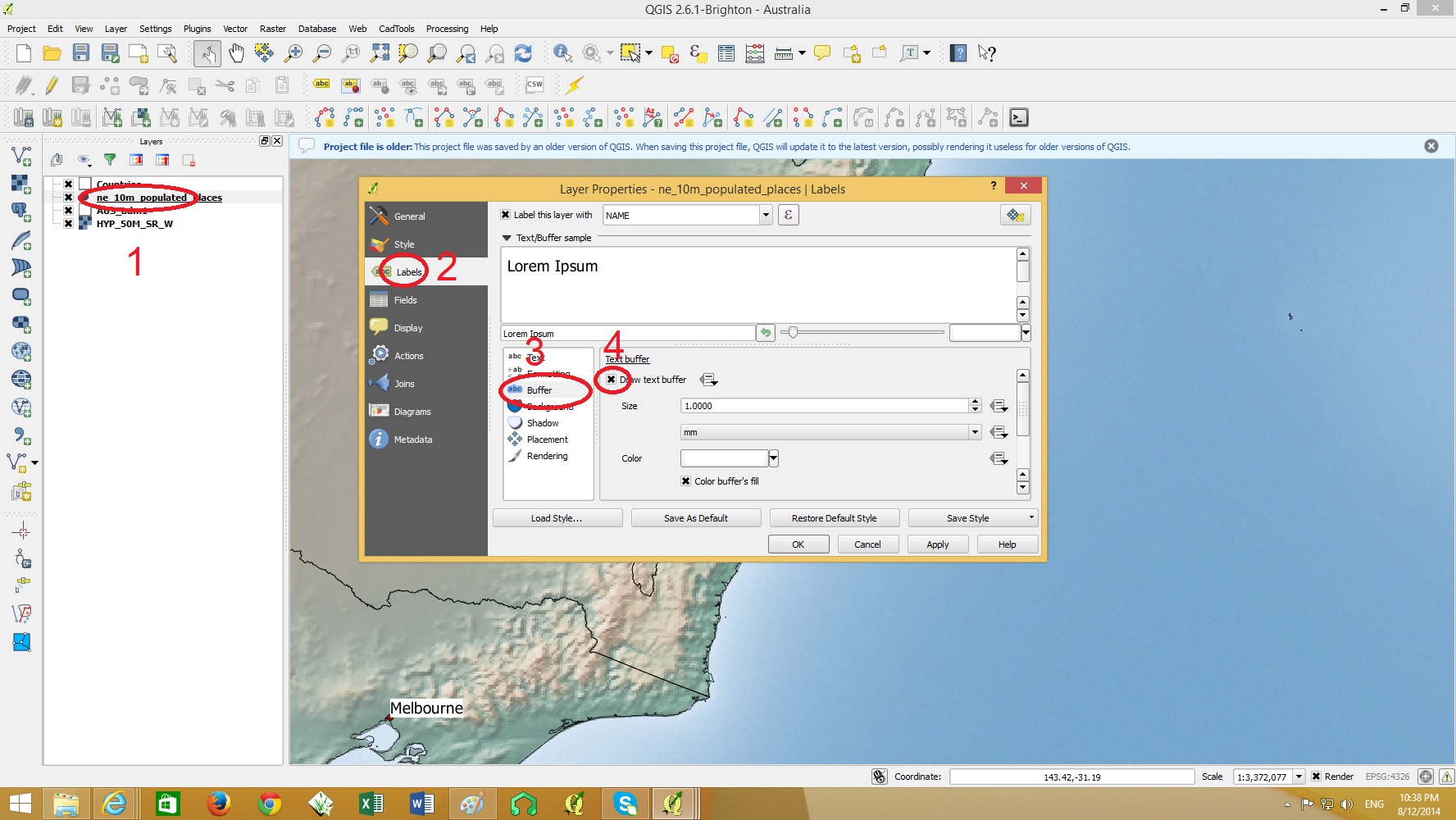
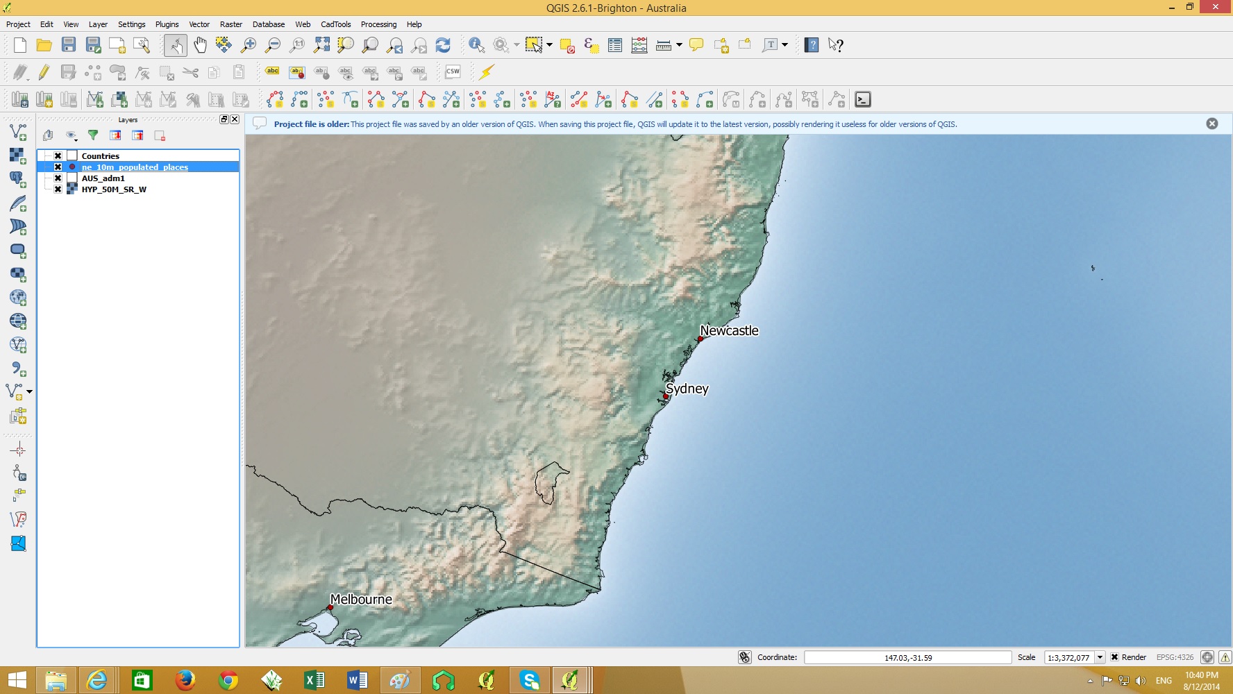
Alternatively you can add a buffer around the text. This option reduces the amount of map features being covered by the text background.

Double click on the layer containing the text > Labels > Buffer>Draw Text Buffer as shown below.

buffer on  text

buffer on  text 2

These text backgrounds and buffers can be any color. It is ideal to choose a color which contrasts well with text color.

How to Add a Scalebar to a Map in QGIS

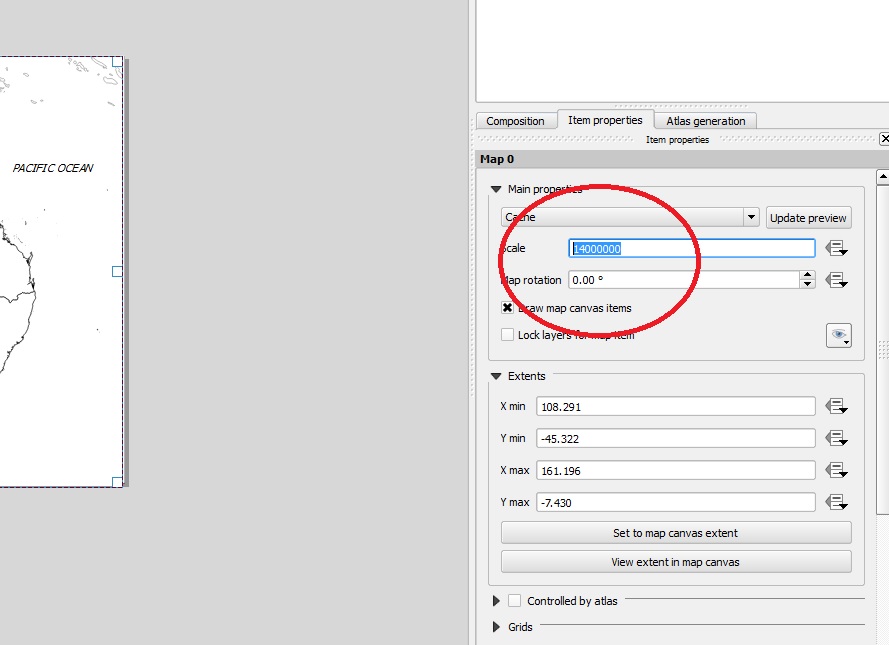
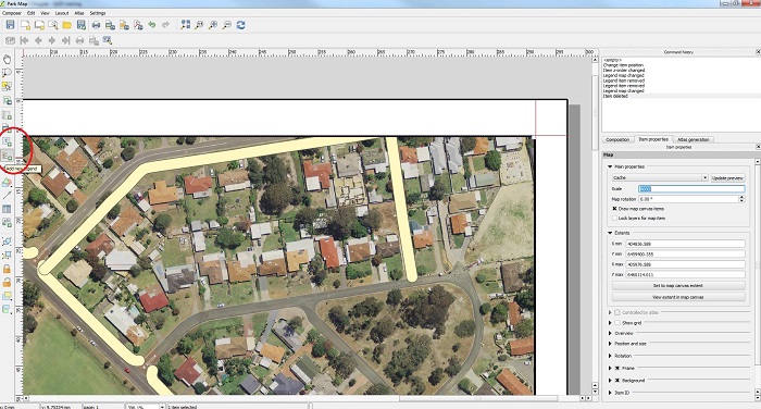
Open composer and the actual scale of the map can be set by selecting the map area and setting the scale in ‘Item Properties’ shown below.

set scale

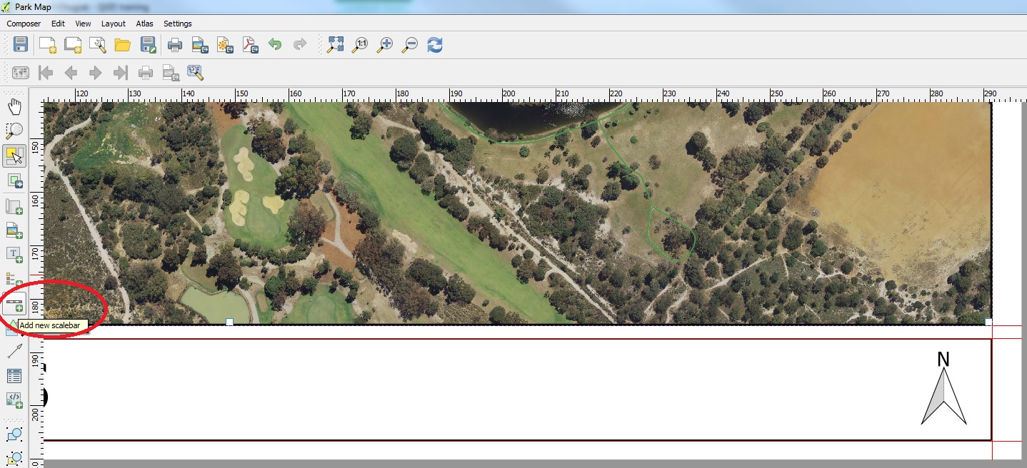
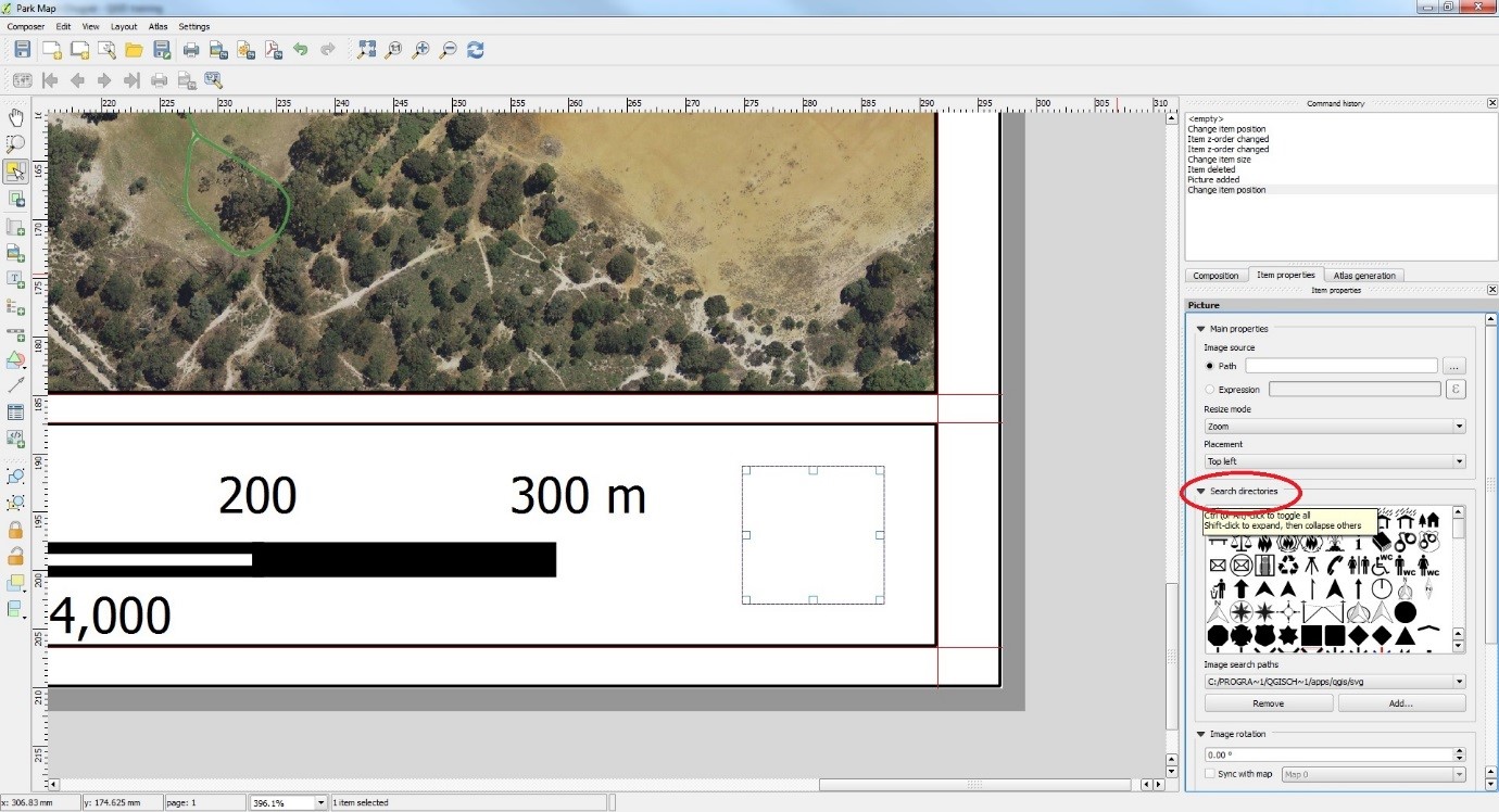
Click on the “Add new scalebar” button on the left side bar.

add scalebar

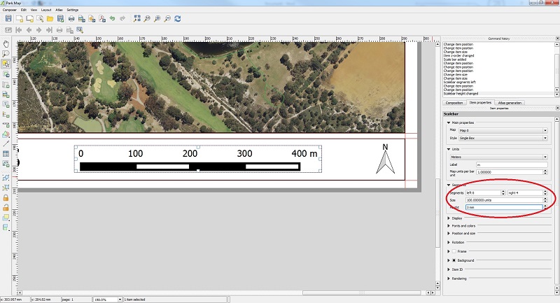
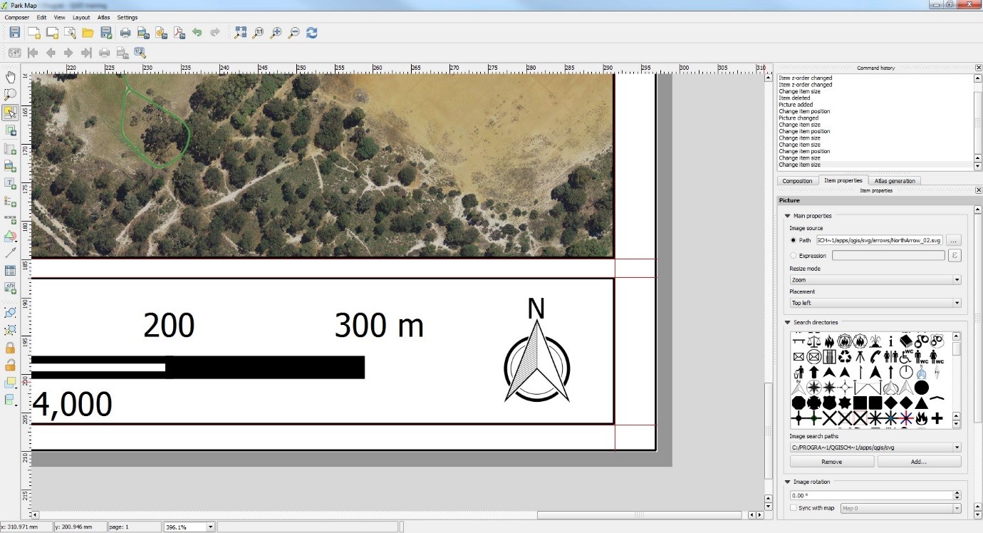
Once the scalebar has been added, you can modify the number of segments and height. The units can also be modified in the item properties.

modify scalebar

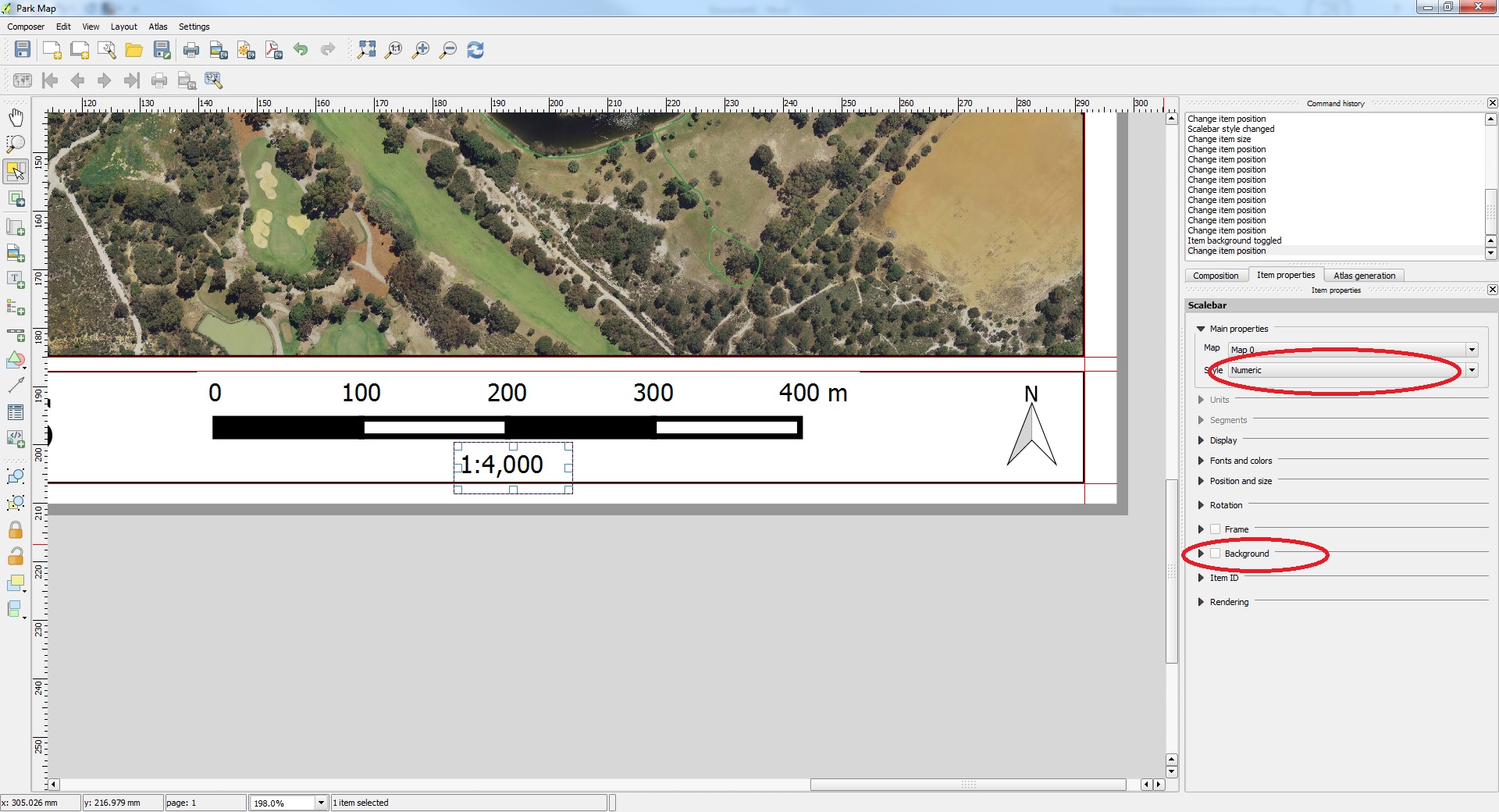
To add a numeric scale click on the “Add new scalebar” button again and place under the first scalebar. Another scalebar will appear. Go to the Item Properties menu again and under main properties change the ‘Style’ to Numeric and uncheck the ‘Background’ box to make the box transparent as shown below.

numeric scale

Search for an attribute in a table in QGIS

In this example we will be searching for a city in a cities layer. Open the table by clicking the ‘Open Attribute table’ icon shown below.

open table clip

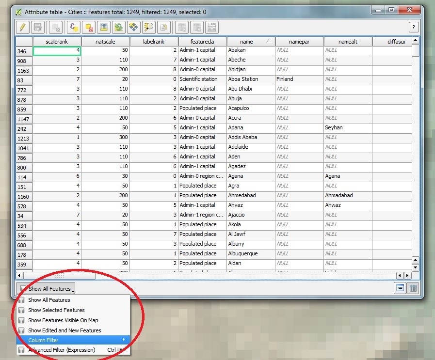
Below the table click on ‘column filter’ > select the column you want to search through. In this case it is the column called ‘name’

column filter

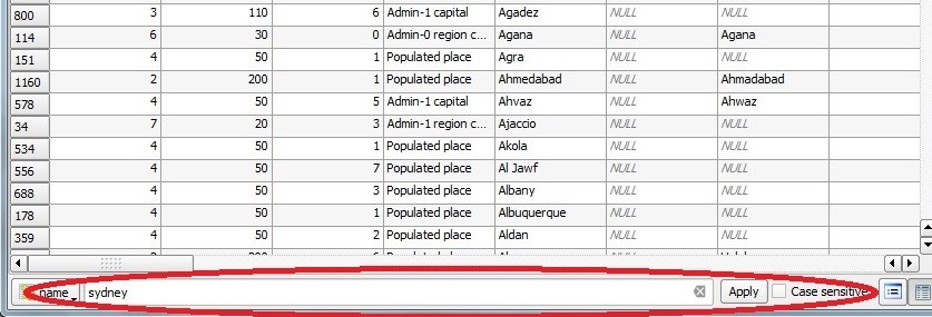
Type in the name of the city you want to find and click apply. Your search can be case sensitive if desired.

search sydney clipped

In this case our search query came up with 2 results as shown below

search result clipped


Georeferencing Image files in QGIS

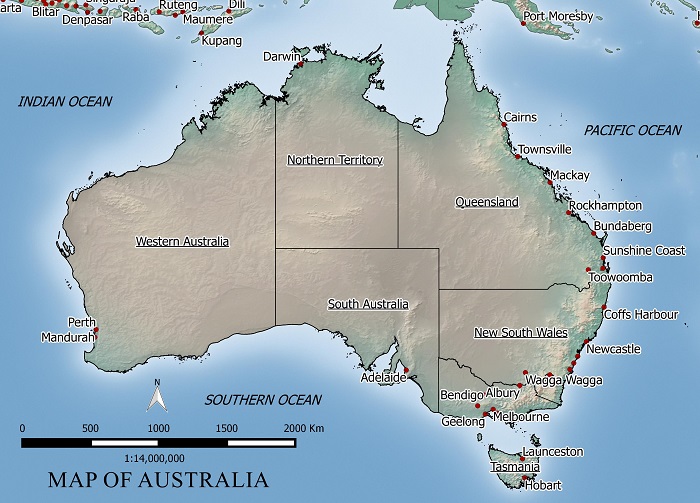
In this example we will georeference a jpeg map of Australia.

FREE MAP OF AUSTRALIA

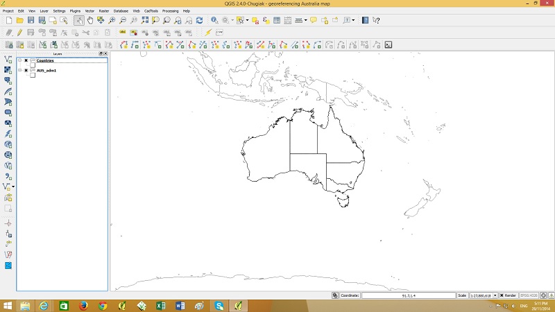
To georeference this map we need some common points to reference the image to. I will use a country layer (shown below) to match points to locations on jpeg map.

just boundaries

Next start Georeferencing by going to the raster menu > Georeferencer

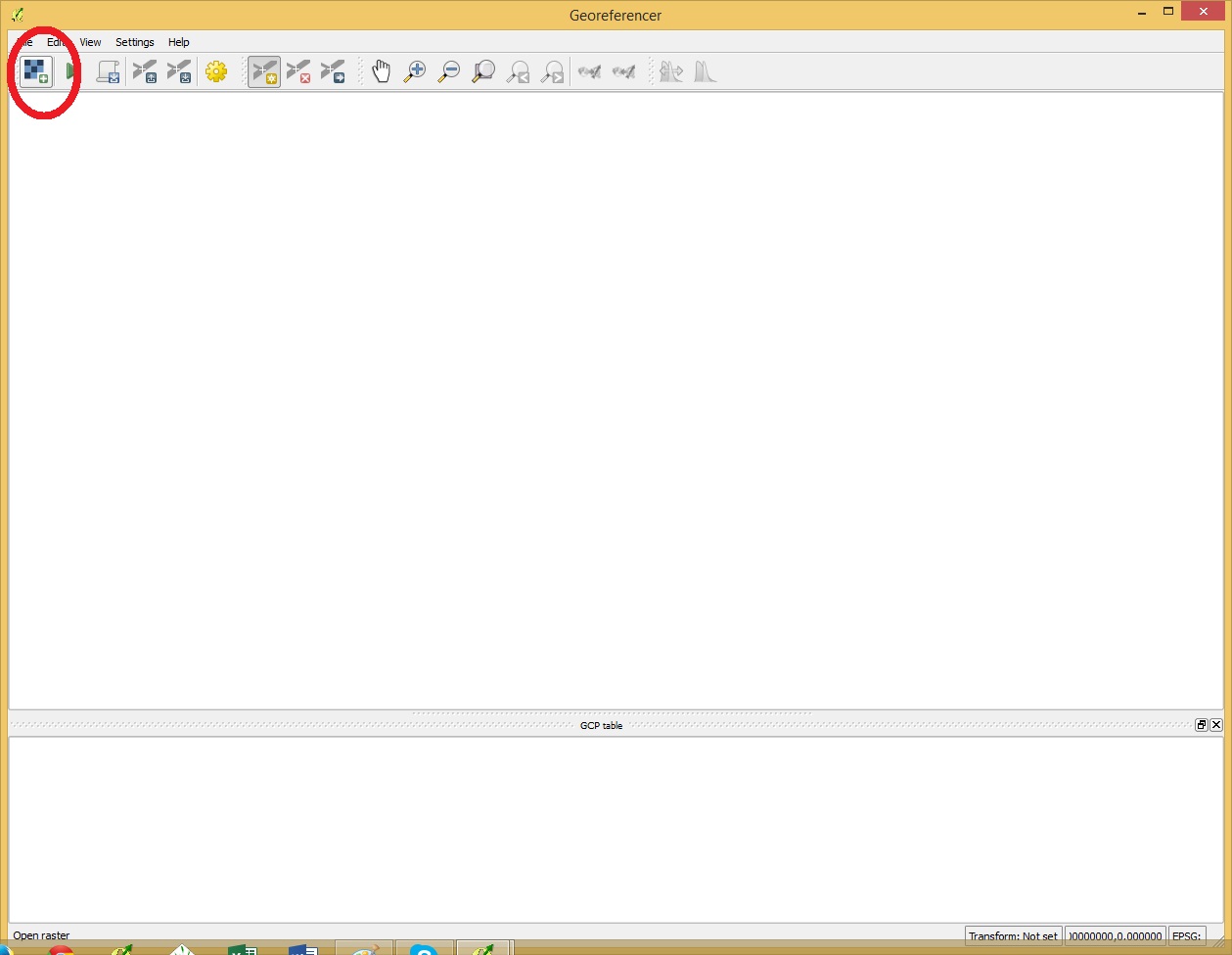
Open a raster by clicking the button shown below.

start georef

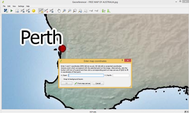
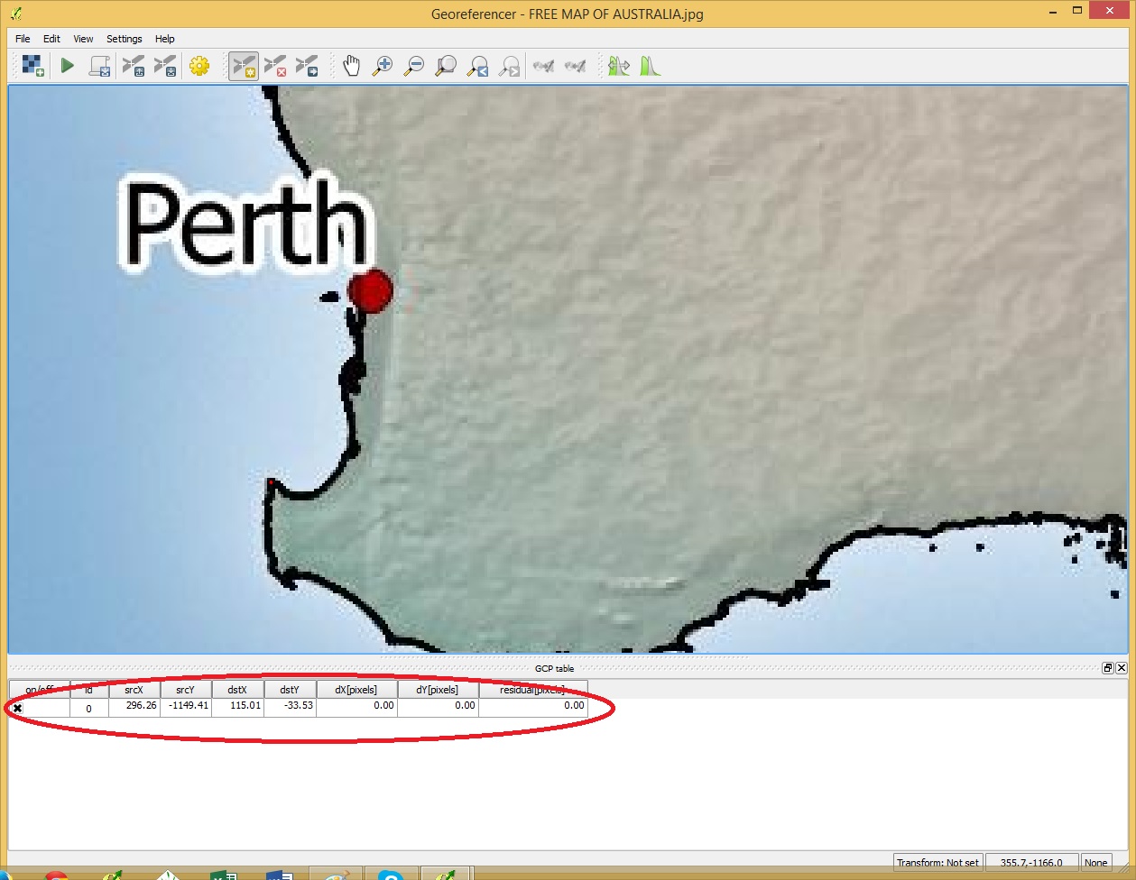
Once the raster has been opened click on a point on the image which can be easily located on the country boundaries layer

click on first point

A popup will showup. select “from map canvas” and find the same point in the country boundary layer.

first point entered

Click OK in the Georeferencer and the point will be added as shown above.

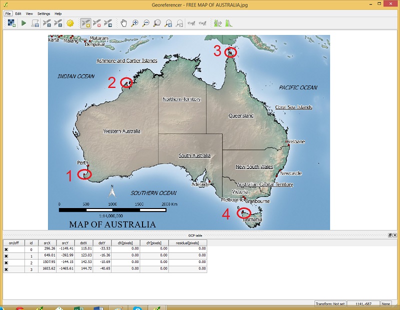
Click on a selection of points spread out over the area of interest like my example below.

digitized points

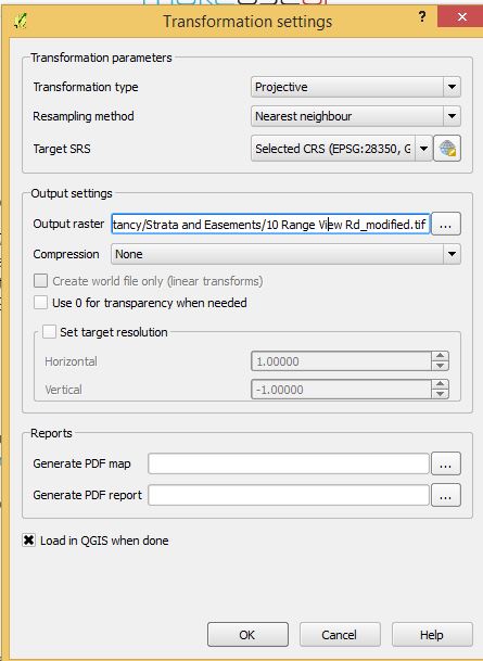
Once the points have been added, got to file menu >  start georeferencing

georeference settings

Specify the transformation settings like above. Use a Projective transformation type is the image needs to be rotated and re-sized. A “Linear” transformation could be used in this example as the image only needs to be re-sized and not rotated. For output raster choose a suitable file name and for Target SRS choose your projection system.

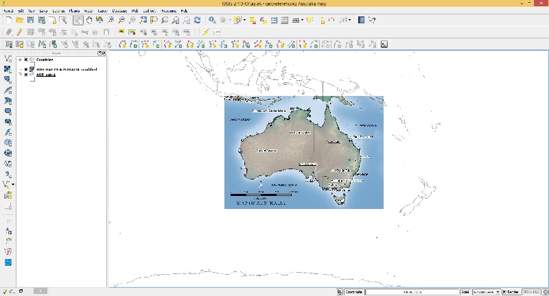
finish

After you click OK the georeferenced image should display in your layers in the correct position.

Creating a new polygon shapefile in QGIS

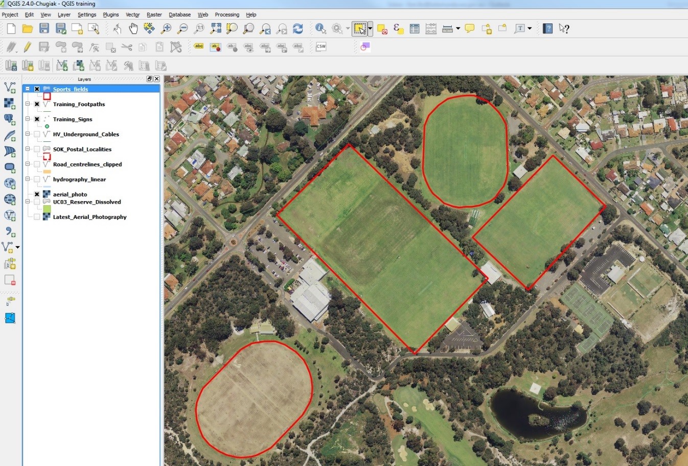
Here we will create a polygon layer by tracing sports fields and adding attribute data.

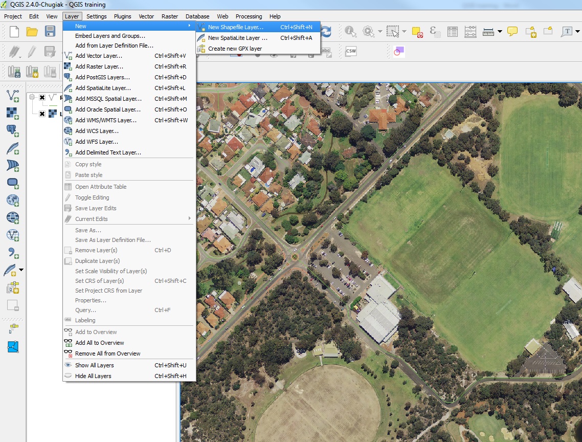
Go to the layer menu>New>New Shapefile layer…

create shapefile

In this example we will trace the boundaries of sporting fields.

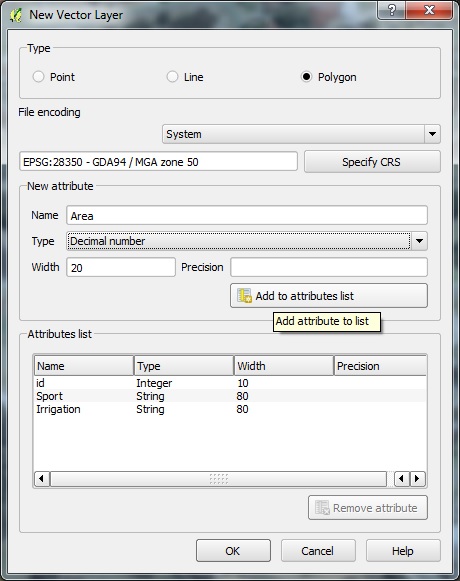
  • Select Polygon
  • Select the appropriate coordinate reference system
  • Create a new Attribute called “Sport” (this will be the type of sport played)
  • Select type “text data”
  • Click “Add to attribute list”
  • Create another attribute called “Irrigation” following the same steps
  • Lastly create an attribute called “Area” this time select decimal number under Type.

new vector layer

  • Finally click OK.
  • Save the file as “Sports_fields” (you always need underscores instead of spaces)
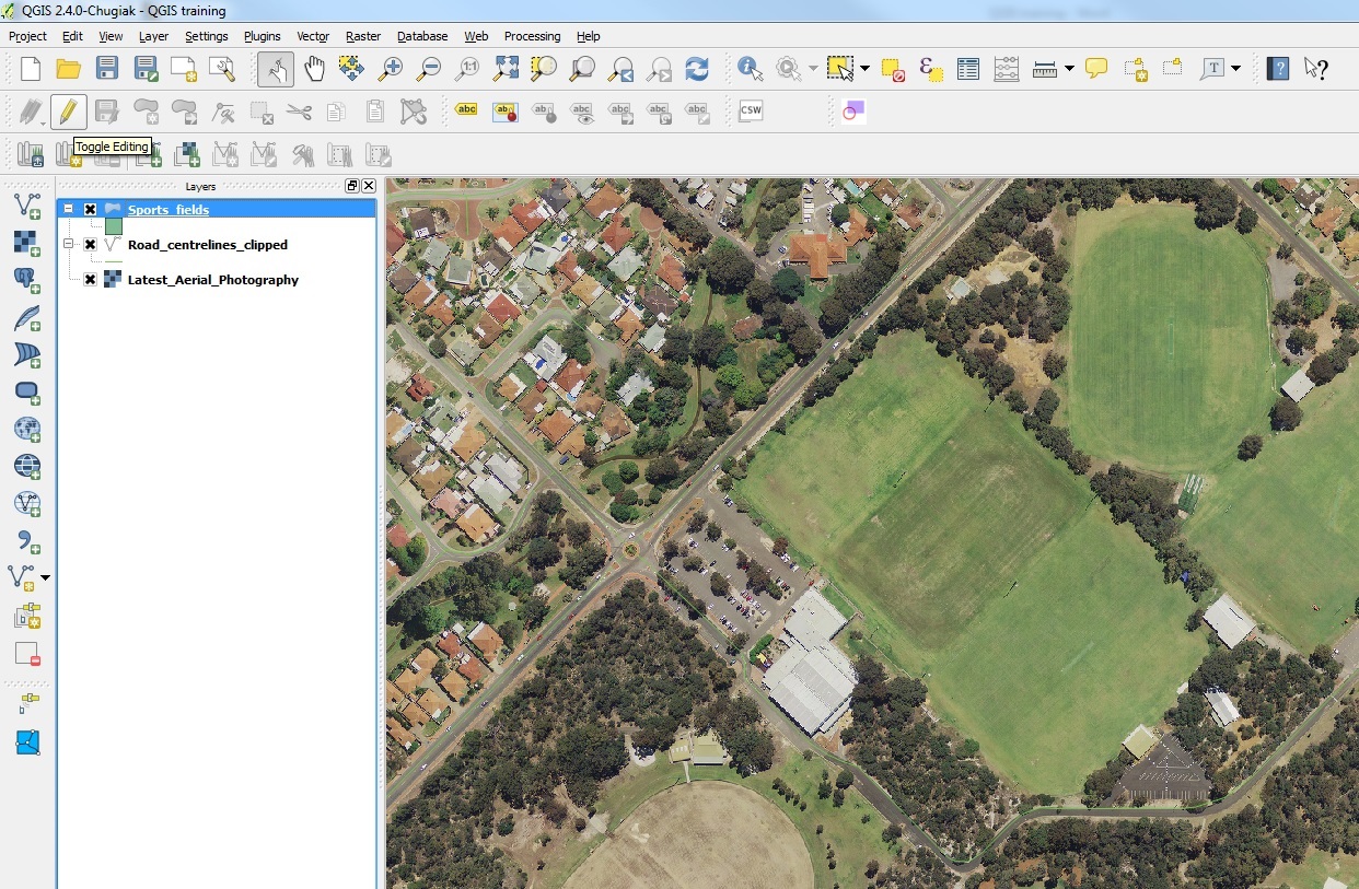
  • The new layer will appear in the layer menu
  • Click on the layer and toggle editing with the pen icon

start editing

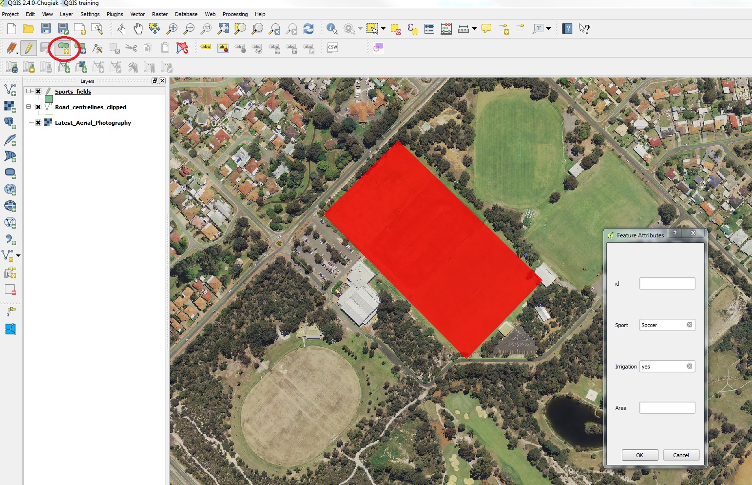
  • Go to the edit menu > add feature
  • Click at each corner of the field and right click to finish
  • Fill in the details as shown below.

add feature

  • Create features around the other fields giving them different attribute data.

digitized sports fields

  • When finished, go to the layer menu > save layer edits
  • Toggle the edit icon to stop editing

Calculating slope from contours using buffers and creating a slope map

Here is a simple way of creating a slope map using contour data to create a vector polygon layer.

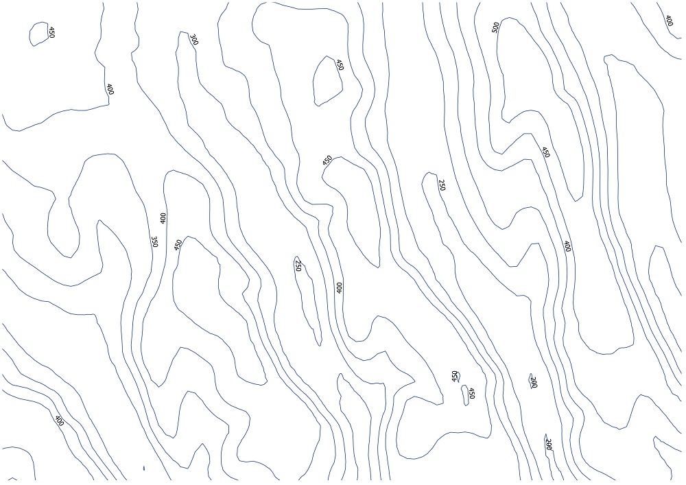
Below we have 50m contour data.

contours only

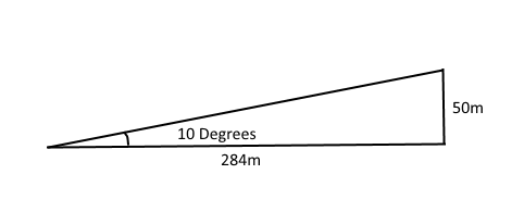
For example to calculate a slope of 10 degrees or greater using 50m contours we must calculate the maximum distance between contour lines that results in a 10 degree slope using a trigonometric equation.

10 degree slope

In this example the maximum distance is 284 meters between the 50m contour lines.

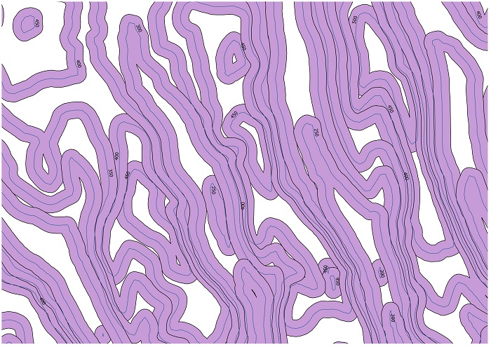
We then halve this distance to get 142 meters and use this value to buffer the contours. Do not dissolve the buffer results as we will need to find the intersects between the buffers.

contours buffered

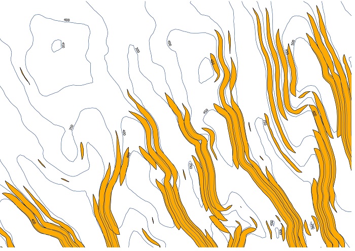
Intersect the buffers to find the overlapping areas. The intersect tool in ArcGIS can be useful for this. These overlaps will signal the contours lines that have 10 degrees or more slope between them.

intersected buffers

These intersected slithers only represent part of the 10 degree slope as the 10 degree slope should in theory cover the entire width between the two contour lines and possibly beyond the contour lines depending on the width of the intersect.

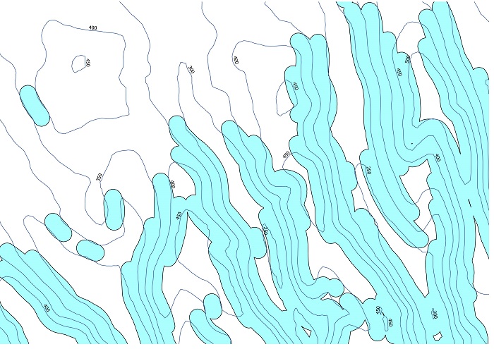
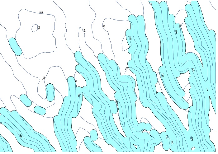
Buffering these intersects using the 142m figure that was calculated previously will extend the slope areas to the nearest contour line and beyond depending on the steepness of the slope. Dissolving this final buffer will create a single feature representing the 10 degrees and above slope.

calculating slope from contours

To calculate slope intervals, you would follow the same process as above with progressively higher slopes while clipping out the lower slope layer with the higher layer until you reach the largest slope interval layer. 


How to create a population map of the US using QGIS

US population by country

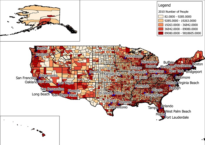
You can create a map of the US showing the population intervals by county.

You can do this by using a free GIS desktop program called QGIS and free GIS data available on various websites.

Download the Census shapefile from the census.gov website here. It should be called ‘County_2010Census_DP1’.

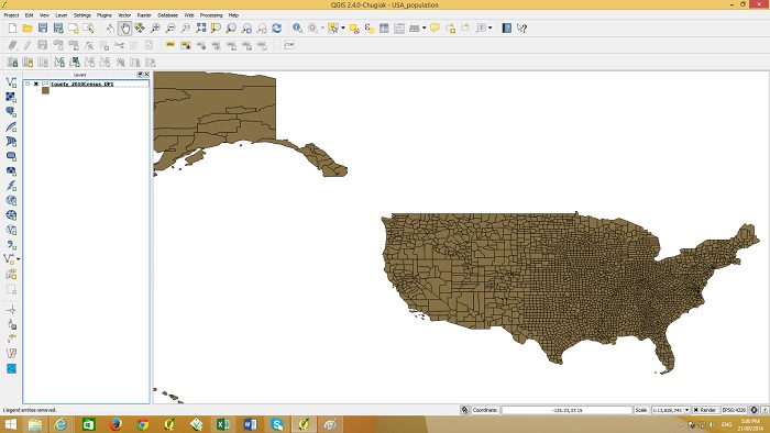
Open the QGIS program and go to the ‘layer’ menu and select ‘add vector layer’. Navigate to the ‘County_2010Census_DP1’ zip file and add it to your map. Alternatively the zip file can be dragged and dropped into the map window. It should appear as below.
counties_screenshot

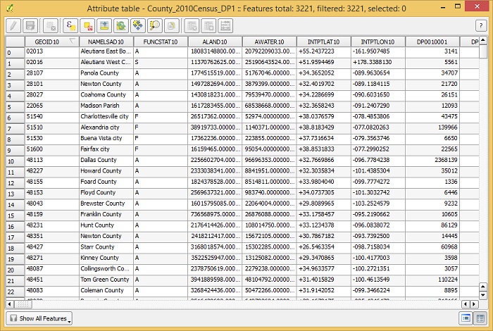
If you right click the layer item on the left and go to ‘open attribute table’ you will see the county names and various population figures in the table.
table_screenshot

In the census zip file there is a file called ‘DP_TableDescriptions’ which explains the column headings of the tables.  The column called ‘DP0010001’ is the column containing total population figures. We will use this column to graduate the colors of the counties according to their population value.

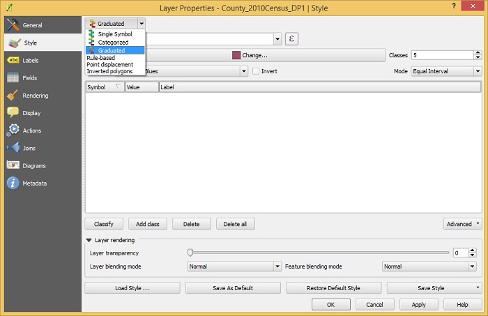
Double click the layer ‘County_2010Census_DP1’ so the layer properties windows appears as shown below.
style_screenshot

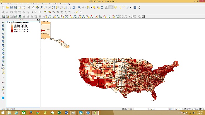
Change from single symbol to graduated and then below that select the column ‘DP0010001’. Under Mode change it to Quantile (equal count) and press OK. The map should look as shown below.
graduated

You can create a printable map, add a frame, legend, north point etc. by using the Print Composer in QGIS.

Go to the file menu and click “New Print Composer”

Give the composer a name such as ” US population”
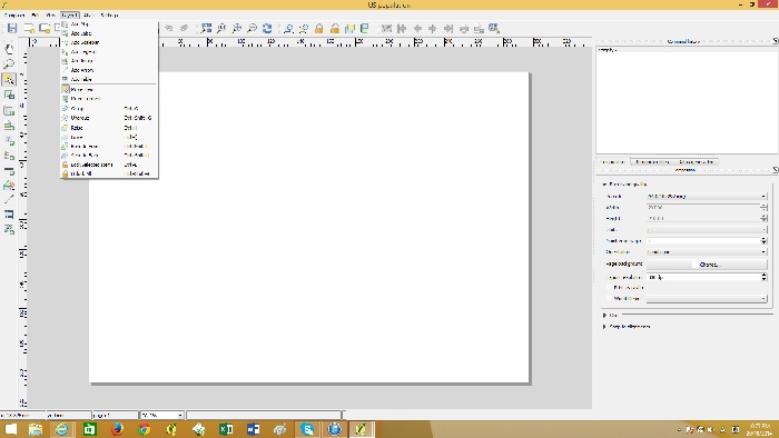
print composer

go to the Layout menu and then “Add Map”. Click at the top left of the canvas and drag to the bottom right. The map should appear like below.
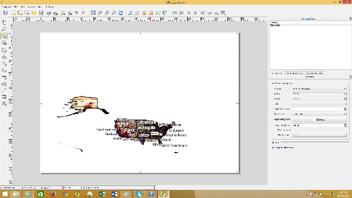
add map

To center and zoom into the map go to the Layout menu and then to “move content”. With this tool you will be able to drag the map to the center and zoom in with the mouse wheel. You can set the scale in the item properties on the right hand side.
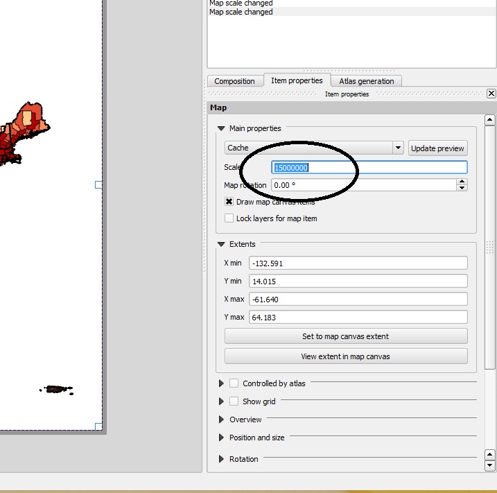
set scale

Once you have centered the mainland of the US, you can add Alaska and Hawaii with the same process by going to the layout menu and then “add map”. This time the map windows willl be smaller for Alaska and Hawaii.
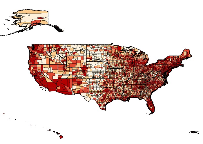
maps added

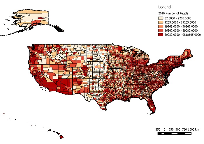
A Legend can be added by going to the layout menu and then “add legend”. A scale bar can also be added through the Layout menu. To export this map as an image file go to the composer menu and then “Export as image”. Your map should look like below.
with legend