Uncategorized

Draw lines specifying length and angle

This function in QGIS allows for CAD-like drafting.

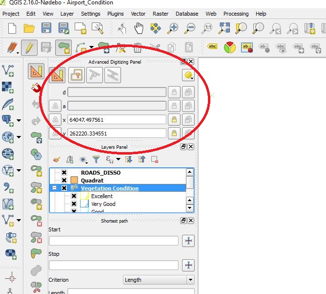
Go to View menu>Panels and show “Advanced Digitizing Panel”

advanced draw

Click the “Add feature” icon and click the start point on the map.

type the “d” key on your keyboard and enter the distance. press enter. This will set the distance.

type the “a” key on your keyboard and enter the angle. press enter. This will set the angle of the line.

How to make your text labels standout on an aerial photo map

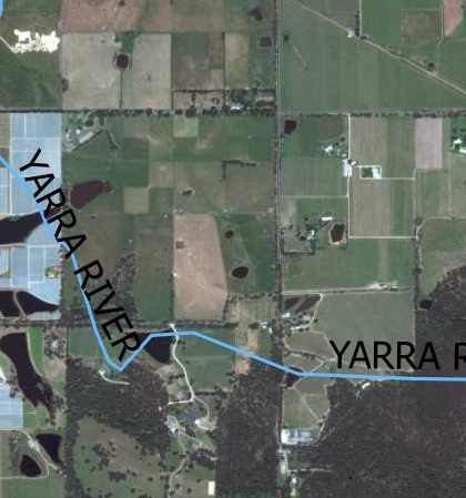
text color black

When creating a map with an aerial photo as it’s base, it is important to make the text labels stand out as plain text can get easily drowned out by the background colors.

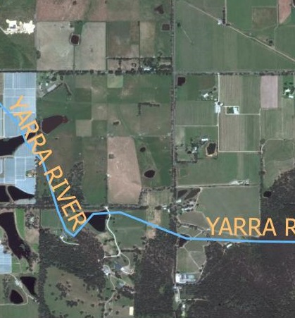
text color Yellow

Yellow is often an appropriate color when the aerial photo is mainly made up of darker colors.

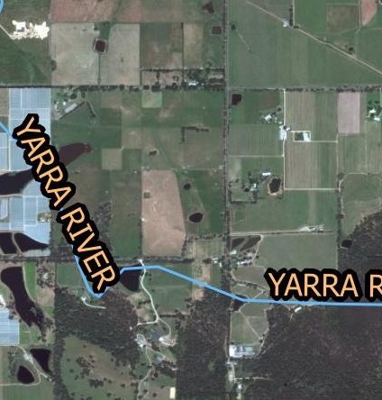
text color buffer

However yellow may not be very visible on light colors like white. A text buffer can overcome this issue. In the example above, I have used yellow text with a black buffer but black text with light buffer is just as effective.

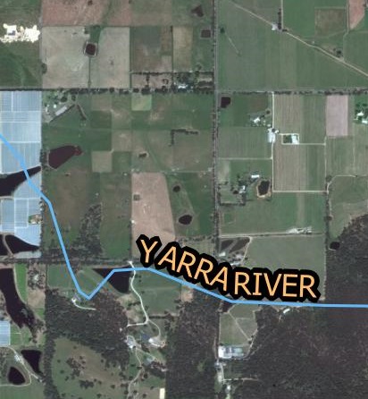
text color curved

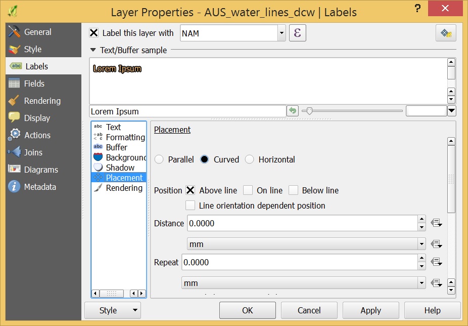
When labeling curvy features such as rivers and roads it is better to curve the text so that it sits neatly along the feature. This function in QGIS is found in the placement option in the layer properties as shown below.

text placement qgis


These are some tips to make your aerial photography maps easier to read and interpret. If you have any comments please let me know below.

Creating a new polygon shapefile in QGIS

Here we will create a polygon layer by tracing sports fields and adding attribute data.

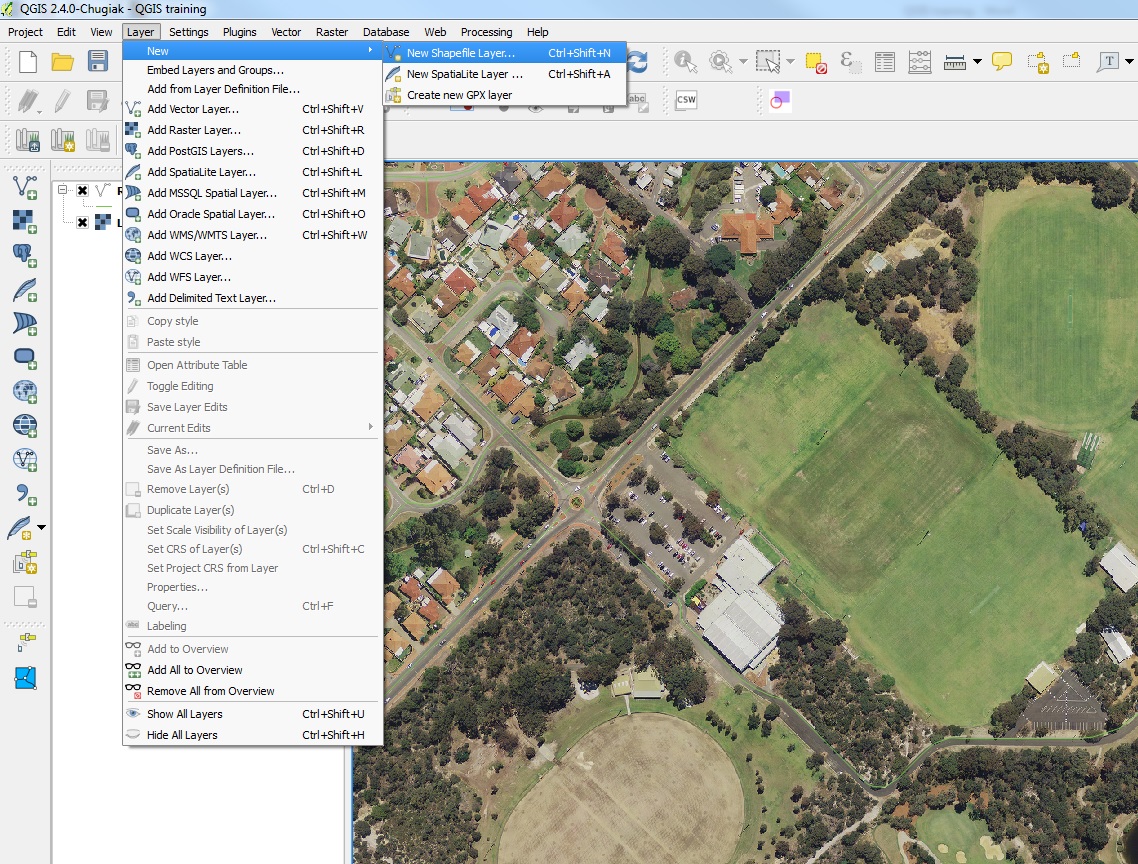
Go to the layer menu>New>New Shapefile layer…

create shapefile

In this example we will trace the boundaries of sporting fields.

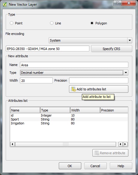
  • Select Polygon
  • Select the appropriate coordinate reference system
  • Create a new Attribute called “Sport” (this will be the type of sport played)
  • Select type “text data”
  • Click “Add to attribute list”
  • Create another attribute called “Irrigation” following the same steps
  • Lastly create an attribute called “Area” this time select decimal number under Type.

new vector layer

  • Finally click OK.
  • Save the file as “Sports_fields” (you always need underscores instead of spaces)
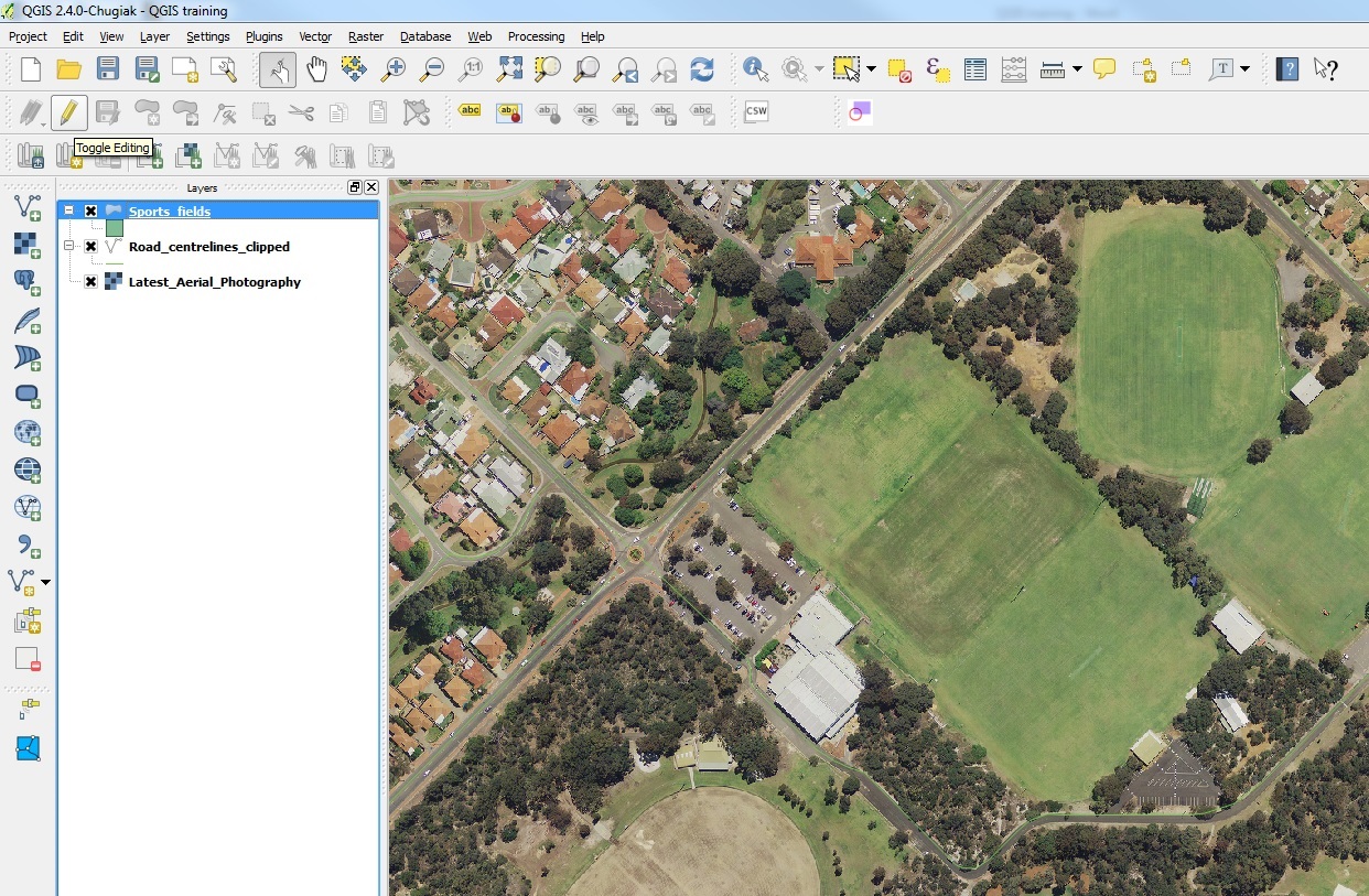
  • The new layer will appear in the layer menu
  • Click on the layer and toggle editing with the pen icon

start editing

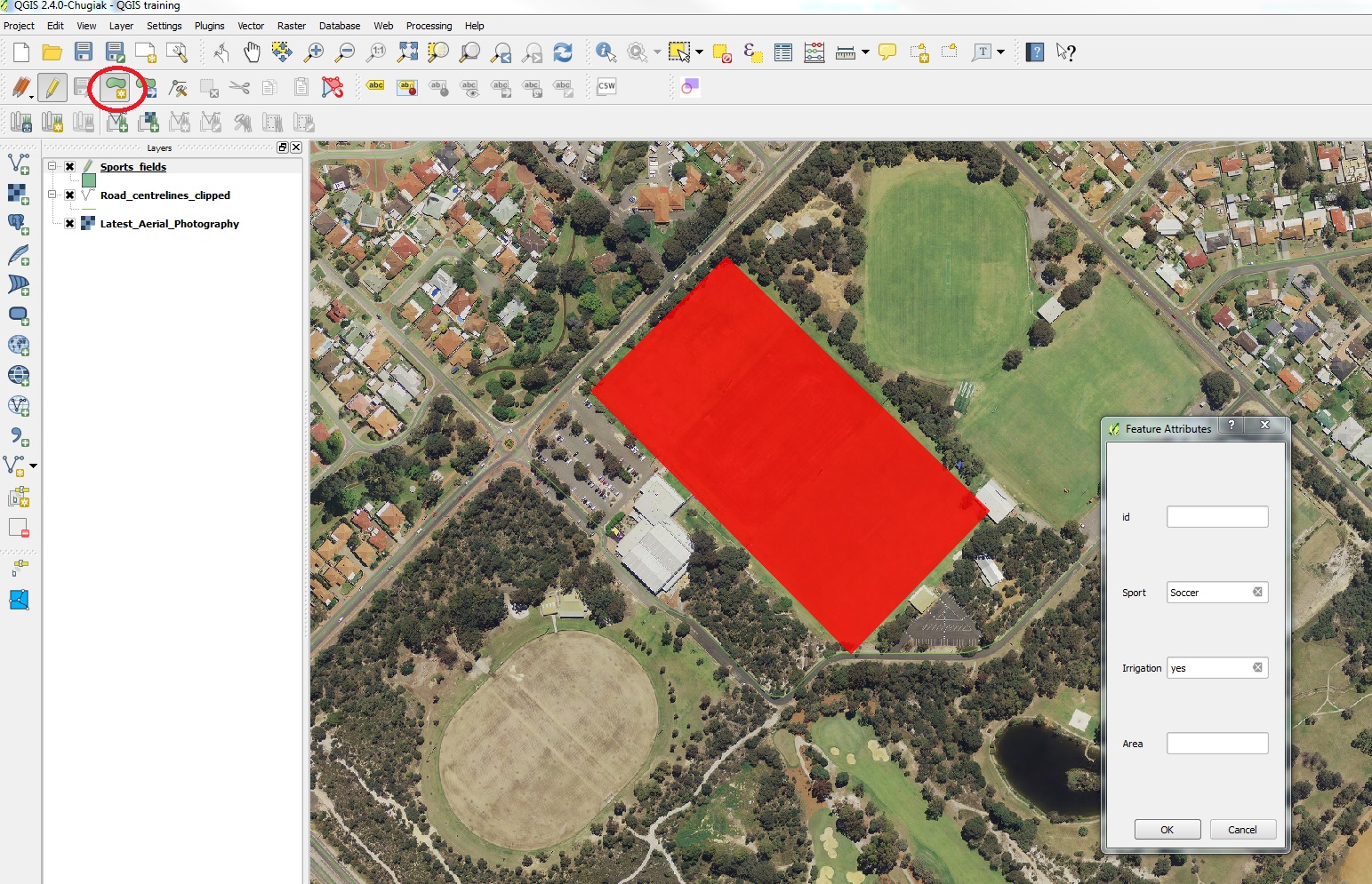
  • Go to the edit menu > add feature
  • Click at each corner of the field and right click to finish
  • Fill in the details as shown below.

add feature

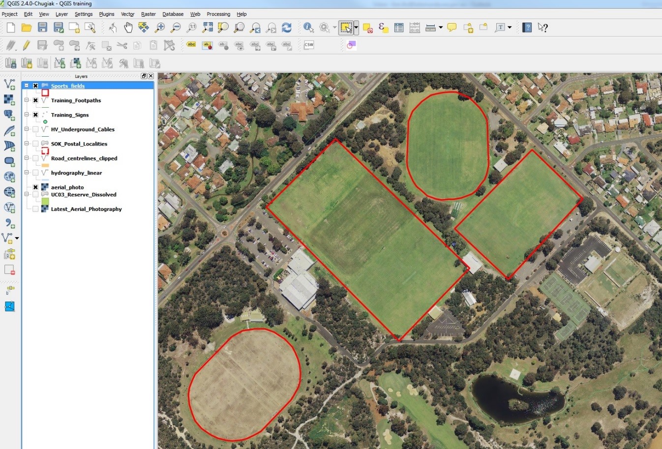
  • Create features around the other fields giving them different attribute data.

digitized sports fields

  • When finished, go to the layer menu > save layer edits
  • Toggle the edit icon to stop editing

Calculating slope from contours using buffers and creating a slope map

Here is a simple way of creating a slope map using contour data to create a vector polygon layer.

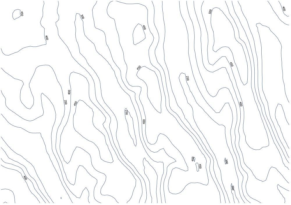
Below we have 50m contour data.

contours only

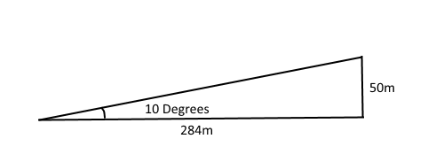
For example to calculate a slope of 10 degrees or greater using 50m contours we must calculate the maximum distance between contour lines that results in a 10 degree slope using a trigonometric equation.

10 degree slope

In this example the maximum distance is 284 meters between the 50m contour lines.

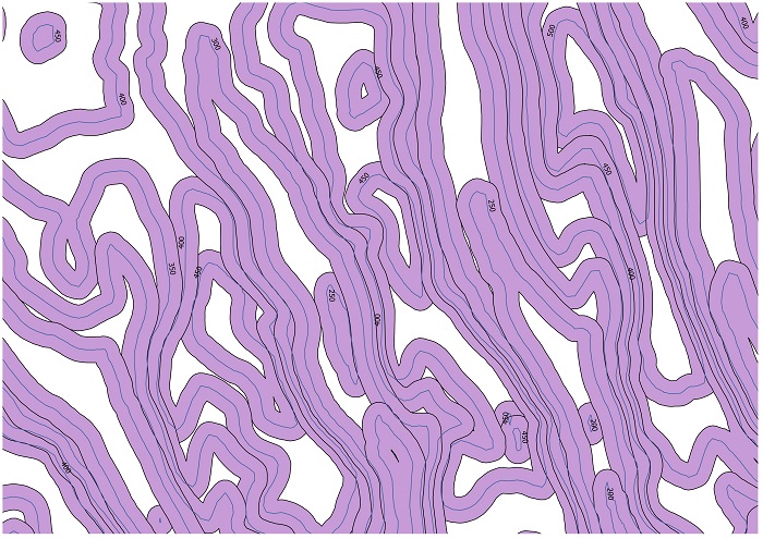
We then halve this distance to get 142 meters and use this value to buffer the contours. Do not dissolve the buffer results as we will need to find the intersects between the buffers.

contours buffered

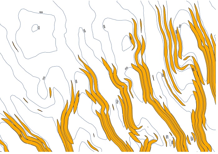
Intersect the buffers to find the overlapping areas. The intersect tool in ArcGIS can be useful for this. These overlaps will signal the contours lines that have 10 degrees or more slope between them.

intersected buffers

These intersected slithers only represent part of the 10 degree slope as the 10 degree slope should in theory cover the entire width between the two contour lines and possibly beyond the contour lines depending on the width of the intersect.

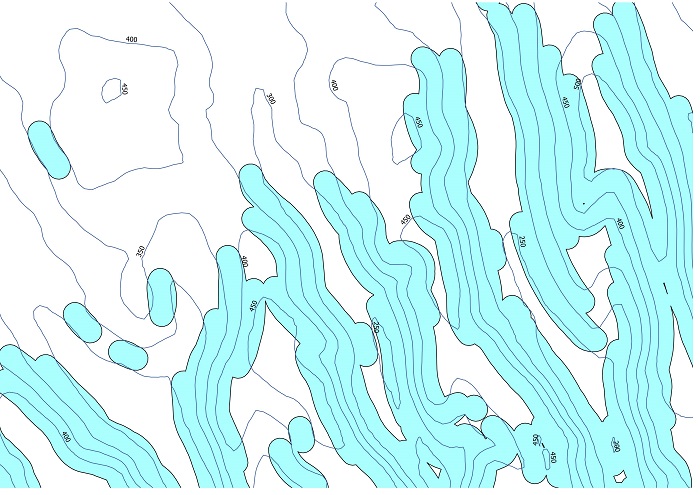
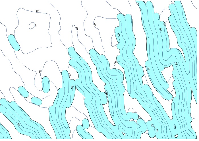
Buffering these intersects using the 142m figure that was calculated previously will extend the slope areas to the nearest contour line and beyond depending on the steepness of the slope. Dissolving this final buffer will create a single feature representing the 10 degrees and above slope.

calculating slope from contours

To calculate slope intervals, you would follow the same process as above with progressively higher slopes while clipping out the lower slope layer with the higher layer until you reach the largest slope interval layer. 


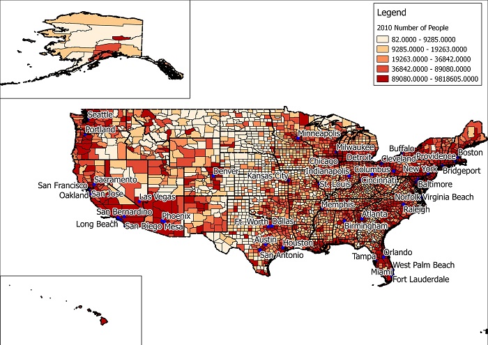
How to create a population map of the US using QGIS

US population by country

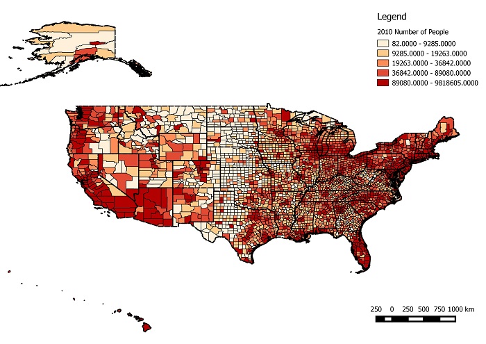
You can create a map of the US showing the population intervals by county.

You can do this by using a free GIS desktop program called QGIS and free GIS data available on various websites.

Download the Census shapefile from the census.gov website here. It should be called ‘County_2010Census_DP1’.

Open the QGIS program and go to the ‘layer’ menu and select ‘add vector layer’. Navigate to the ‘County_2010Census_DP1’ zip file and add it to your map. Alternatively the zip file can be dragged and dropped into the map window. It should appear as below.
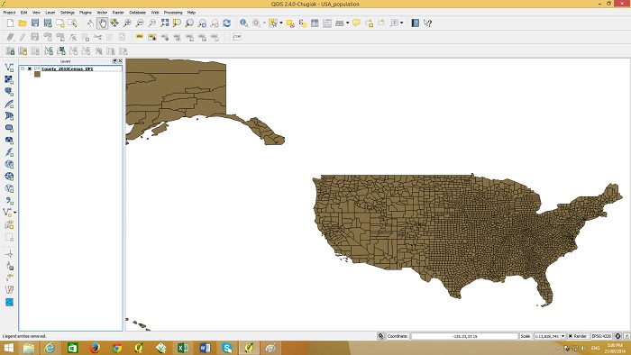
counties_screenshot

If you right click the layer item on the left and go to ‘open attribute table’ you will see the county names and various population figures in the table.
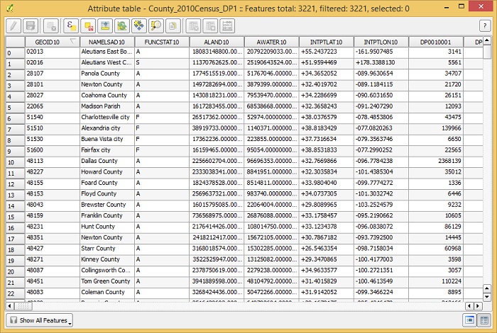
table_screenshot

In the census zip file there is a file called ‘DP_TableDescriptions’ which explains the column headings of the tables.  The column called ‘DP0010001’ is the column containing total population figures. We will use this column to graduate the colors of the counties according to their population value.

Double click the layer ‘County_2010Census_DP1’ so the layer properties windows appears as shown below.
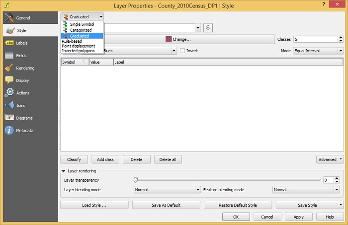
style_screenshot

Change from single symbol to graduated and then below that select the column ‘DP0010001’. Under Mode change it to Quantile (equal count) and press OK. The map should look as shown below.
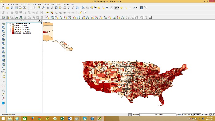
graduated

You can create a printable map, add a frame, legend, north point etc. by using the Print Composer in QGIS.

Go to the file menu and click “New Print Composer”

Give the composer a name such as ” US population”
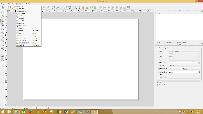
print composer

go to the Layout menu and then “Add Map”. Click at the top left of the canvas and drag to the bottom right. The map should appear like below.
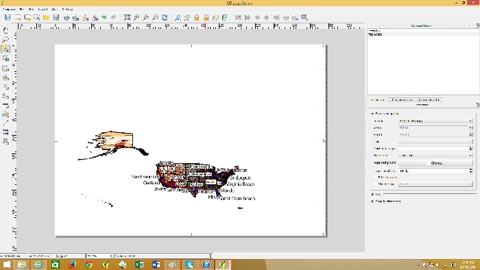
add map

To center and zoom into the map go to the Layout menu and then to “move content”. With this tool you will be able to drag the map to the center and zoom in with the mouse wheel. You can set the scale in the item properties on the right hand side.
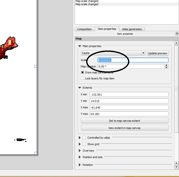
set scale

Once you have centered the mainland of the US, you can add Alaska and Hawaii with the same process by going to the layout menu and then “add map”. This time the map windows willl be smaller for Alaska and Hawaii.
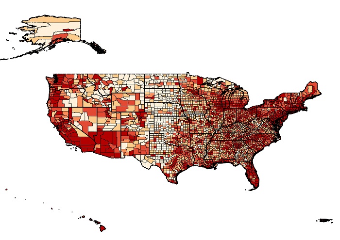
maps added

A Legend can be added by going to the layout menu and then “add legend”. A scale bar can also be added through the Layout menu. To export this map as an image file go to the composer menu and then “Export as image”. Your map should look like below.
with legend