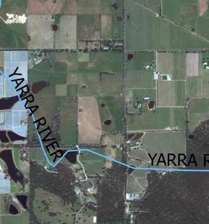
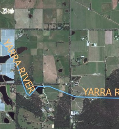
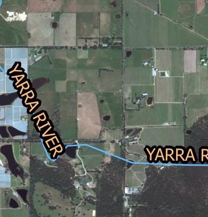
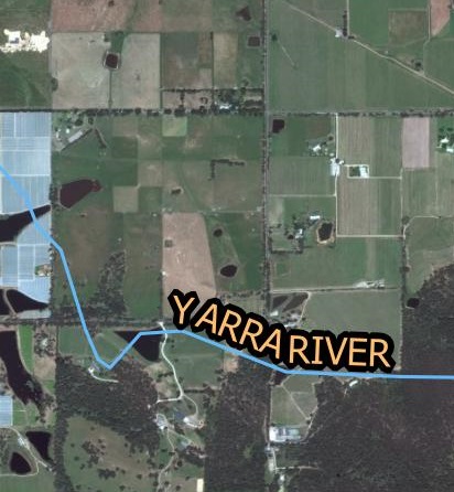
When creating a map with an aerial photo as it’s base, it is important to make the text labels stand out as plain text can get easily drowned out by the background colors.
Yellow is often an appropriate color when the aerial photo is mainly made up of darker colors.
However yellow may not be very visible on light colors like white. A text buffer can overcome this issue. In the example above, I have used yellow text with a black buffer but black text with light buffer is just as effective.
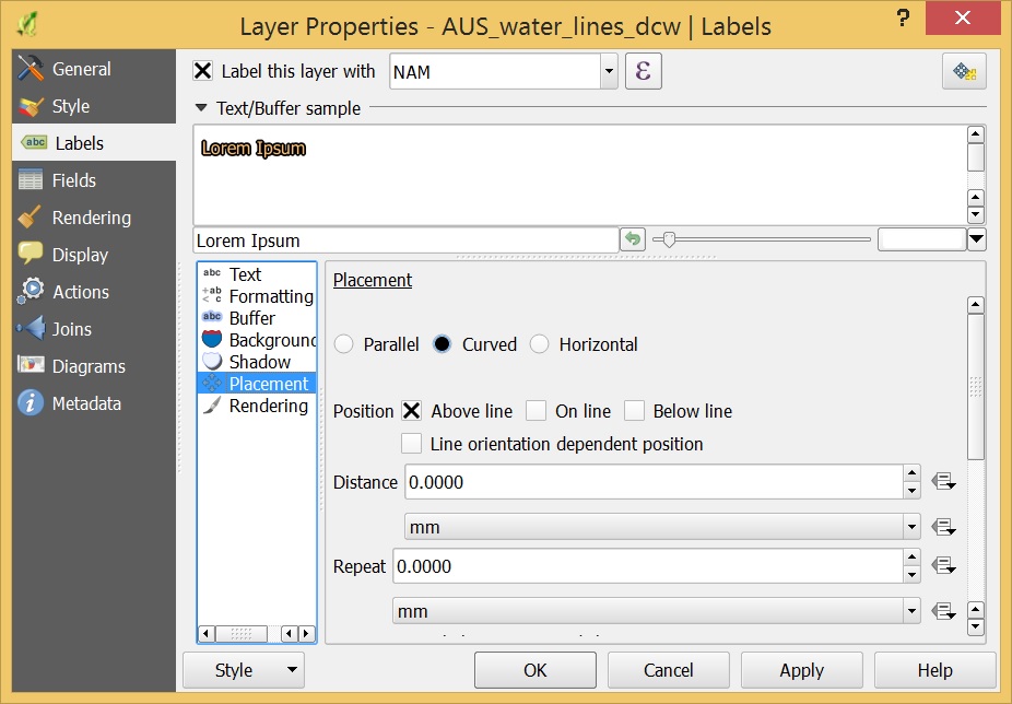
When labeling curvy features such as rivers and roads it is better to curve the text so that it sits neatly along the feature. This function in QGIS is found in the placement option in the layer properties as shown below.
These are some tips to make your aerial photography maps easier to read and interpret. If you have any comments please let me know below.
