You can create a map of the US showing the population intervals by county.
You can do this by using a free GIS desktop program called QGIS and free GIS data available on various websites.
Download the Census shapefile from the census.gov website here. It should be called ‘County_2010Census_DP1’.
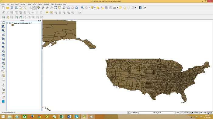
Open the QGIS program and go to the ‘layer’ menu and select ‘add vector layer’. Navigate to the ‘County_2010Census_DP1’ zip file and add it to your map. Alternatively the zip file can be dragged and dropped into the map window. It should appear as below.
If you right click the layer item on the left and go to ‘open attribute table’ you will see the county names and various population figures in the table.
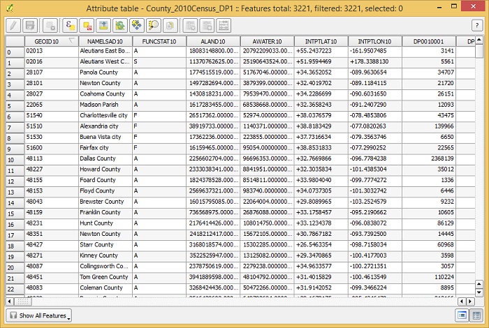
In the census zip file there is a file called ‘DP_TableDescriptions’ which explains the column headings of the tables. The column called ‘DP0010001’ is the column containing total population figures. We will use this column to graduate the colors of the counties according to their population value.
Double click the layer ‘County_2010Census_DP1’ so the layer properties windows appears as shown below.
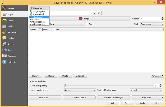
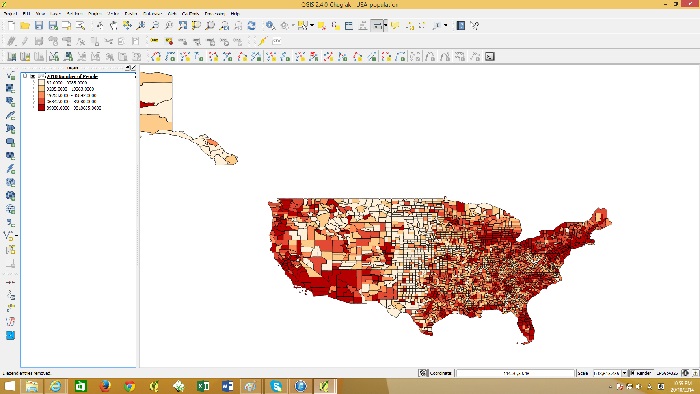
Change from single symbol to graduated and then below that select the column ‘DP0010001’. Under Mode change it to Quantile (equal count) and press OK. The map should look as shown below.
You can create a printable map, add a frame, legend, north point etc. by using the Print Composer in QGIS.
Go to the file menu and click “New Print Composer”
Give the composer a name such as ” US population”
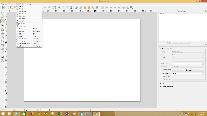
go to the Layout menu and then “Add Map”. Click at the top left of the canvas and drag to the bottom right. The map should appear like below.
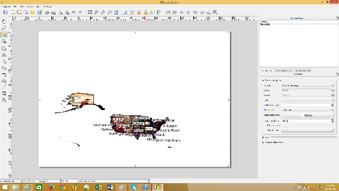
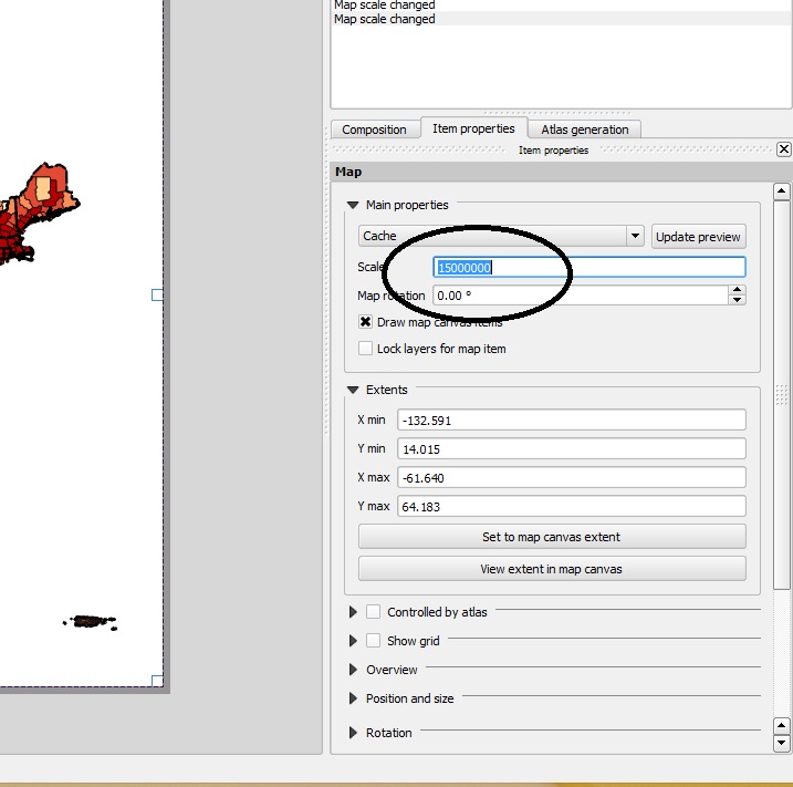
To center and zoom into the map go to the Layout menu and then to “move content”. With this tool you will be able to drag the map to the center and zoom in with the mouse wheel. You can set the scale in the item properties on the right hand side.
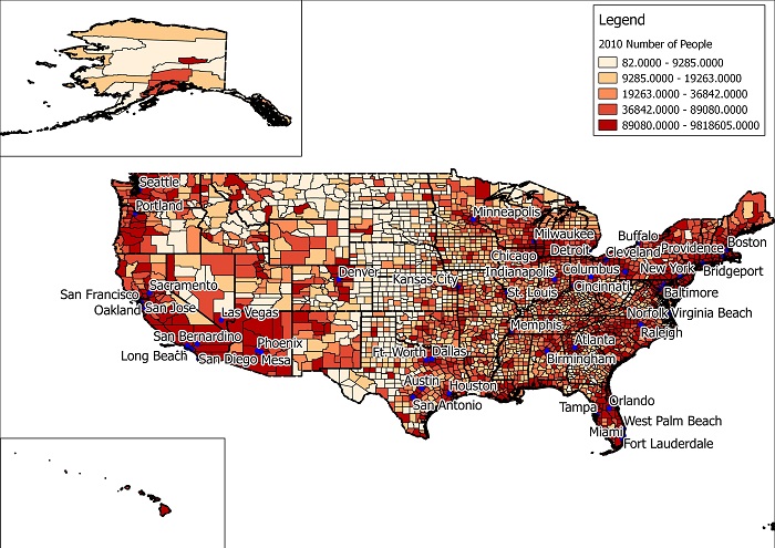
Once you have centered the mainland of the US, you can add Alaska and Hawaii with the same process by going to the layout menu and then “add map”. This time the map windows willl be smaller for Alaska and Hawaii.
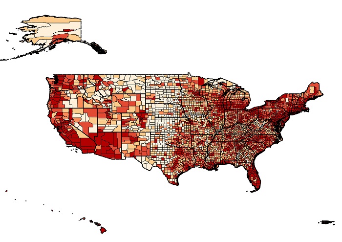
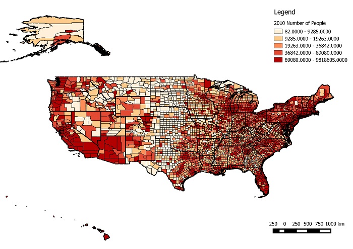
A Legend can be added by going to the layout menu and then “add legend”. A scale bar can also be added through the Layout menu. To export this map as an image file go to the composer menu and then “Export as image”. Your map should look like below.